Convert em to rem at any parent font size
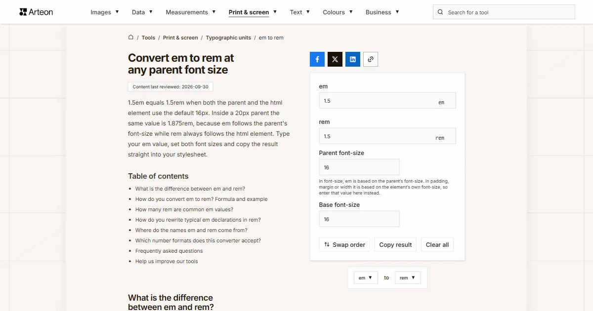
1.5em equals 1.5rem when both the parent and the html element use the default 16px. Inside a 20px parent the same value is 1.875rem, because em follows the parent's font-size while rem always follows the html element. Type your em value, set both font sizes and copy the result straight into your stylesheet.
In font-size, em is based on the parent’s font-size. In padding, margin or width it is based on the element’s own font-size, so enter that value here instead.
What is the difference between em and rem?
Both units measure length in font sizes, but each takes the font size from a different place. An em is the font-size of the element you use it on, and inside the font-size property itself it is the size inherited from the parent[1]. A rem is the font-size of the html element, the root of the whole document, so it means the same thing everywhere in your stylesheet[1].
Rem is the newer of the two. The W3C guide to CSS units says CSS has had it since 2013, to make rules that depend only on the default font size easier to write[2]. The guide shows it with an h1 set to 3em: to line its left margin up with a paragraph, the old style sheet needed 0.333em, while the new one simply says 1rem. That is exactly the sum this converter does for you.
The html element usually starts at 16px in browsers, but readers can change that in their settings[3]. If you need pixels rather than rem, use the em to px converter or the rem to px converter.
How do you convert em to rem? Formula and example
The formula has two steps: rem = em × parent font size ÷ html font size. The multiplication turns em into pixels, and the division turns those pixels into rem.
Take a heading with font-size: 1.5em inside a block whose text is 20px. That gives 1.5 × 20 = 30px, and 30 ÷ 16 = 1.875rem. When the parent is 16px, like the html element, the two steps cancel out and 1.5em is simply 1.5rem.
What goes into the Parent font-size field depends on the property. In font-size, em follows the parent. In padding, margin or width it follows the element's own font-size[1], so that is the number to enter. A 32px h1 with margin-bottom: 0.5em therefore has a 16px gap, which is 1rem, and you would type 32 in the field.
The Base font-size field is the html element. If your stylesheet starts with html { font-size: 62.5% }, type 62.5% and the converter works out 10px from it. On that base, 1.5em inside a 16px parent comes to 2.4rem.
How many rem are common em values?
| Value in em | 14px parent | 18px parent | 20px parent | 24px parent |
|---|---|---|---|---|
| 0.25 em | 0.2188 rem | 0.2813 rem | 0.3125 rem | 0.375 rem |
| 0.5 em | 0.4375 rem | 0.5625 rem | 0.625 rem | 0.75 rem |
| 0.625 em | 0.5469 rem | 0.7031 rem | 0.7813 rem | 0.9375 rem |
| 0.75 em | 0.6563 rem | 0.8438 rem | 0.9375 rem | 1.125 rem |
| 0.875 em | 0.7656 rem | 0.9844 rem | 1.0938 rem | 1.3125 rem |
| 1 em | 0.875 rem | 1.125 rem | 1.25 rem | 1.5 rem |
| 1.125 em | 0.9844 rem | 1.2656 rem | 1.4063 rem | 1.6875 rem |
| 1.25 em | 1.0938 rem | 1.4063 rem | 1.5625 rem | 1.875 rem |
| 1.5 em | 1.3125 rem | 1.6875 rem | 1.875 rem | 2.25 rem |
| 1.75 em | 1.5313 rem | 1.9688 rem | 2.1875 rem | 2.625 rem |
| 2 em | 1.75 rem | 2.25 rem | 2.5 rem | 3 rem |
| 2.5 em | 2.1875 rem | 2.8125 rem | 3.125 rem | 3.75 rem |
| 3 em | 2.625 rem | 3.375 rem | 3.75 rem | 4.5 rem |
How do you rewrite typical em declarations in rem?
| Declaration in em | What the em is based on | Same size in rem |
|---|---|---|
| p { margin-bottom: 1em } in 16px text | The paragraph's font-size, 16px | 1 rem |
| h1 { font-size: 2em } in a 16px body | The parent's font size, 16px | 2 rem |
| h1 { margin-bottom: 0.5em } on a 32px h1 | The heading's font-size, 32px | 1 rem |
| .card { font-size: 0.875em } in a 16px body | The parent's font size, 16px | 0.875 rem |
| .card h2 { font-size: 1.25em } | The card's font size, 14px | 1.0938 rem |
| button { padding: 0.5em } on a 14px button | The button's font-size, 14px | 0.4375 rem |
| li li li { font-size: 1.2em } | The second-level list's font size, 23.04px | 1.728 rem |
Where do the names em and rem come from?
The em is older than the web by several centuries. In metal type, the point size, and with it the em, was the height of the metal body the letter rises from, so one em in 16-point type is 16 points[4]. The name comes from the em quad, a blank piece of type used for spacing, and the em space in digital fonts is still one em wide[4].
You may have read that an em is the width of a capital M. Wikipedia lists that as an obsolete alternative definition, and in many typefaces the M does not fill the em square at all[4]. In CSS the M plays no part, and 1em is simply the current font-size.
Rem stands for root em, the em of the document's root element[2]. That root is the html element, so a rem is an em measured from one fixed font size.

Which number formats does this converter accept?
| What you type | What the converter shows | Note |
|---|---|---|
| 1.5 | 1.5 rem | The point is our decimal separator, so we read the number as one and a half. |
| 1,5 | 1.5 rem | A comma followed by one digit is a European decimal comma, so a value copied from a colleague in Germany or France gives the same result. |
| font-size: 1.5em; | 1.5 rem | You can paste a whole declaration from your stylesheet, because we only take the number from it. |
| margin: -0.5em; | -0.5 rem | The minus sign stays, since a negative margin in em becomes a negative margin in rem. |
| .875 | 0.875 rem | A value without the leading zero, common in minified CSS, is read as 0.875. |
| 3/4 | 0.75 rem | We work out the fraction straight away, so there is no need to turn it into 0.75 first. |
| 1½ | 1.5 rem | The ½ character is added to the number before it, so one and a half em gives 1.5rem. |
| 1.5rem | 1.5 rem | A rem value pasted into the em field is converted to em using both font-size fields, and a line under the field tells you so. |
| 24px | 1.5 rem | Pixels are divided by the parent's font size, so 24px at 16px lands in the field as 1.5em, with a line under the field explaining the change. |
Convert other units to rem
Convert em to other units
Sources
- CSS Values and Units Module Level 4 — W3C
- CSS: em, px, pt, cm, in… — W3C
- <length> CSS type — MDN Web Docs
- Em (typography) — Wikipedia
- line-height — MDN Web Docs
Every figure in the tables was computed from the unit definitions and checked arithmetically before publication. Historical values and the names of local units come from the sources listed above.
Content last reviewed: · written and checked by the Arteon team
Frequently asked questions
Do em and rem give the same result in a media query?
Yes. Inside a media query both units are based on the initial value of font-size, not on your page's styles[1]. A 48em breakpoint and a 48rem breakpoint therefore fire at the same width, even if your stylesheet changes the html font size.
Should line-height in em be rewritten in rem too?
It is better written as a plain number, such as line-height: 1.5. A unitless number is multiplied by each element's own font size, while a value with a unit is inherited as a fixed length and can leave lines squashed together in larger headings[5].
What happens to rem when a reader picks a larger default font in the browser?
If your stylesheet does not set the html font size in pixels, rem follows the size the reader chose, so a layout built in rem grows with it. A rule such as html { font-size: 16px } blocks that setting.
Why does the result have four decimal places?
Dividing by 16 gives fractions such as 0.4375 or 1.0938. With four places and a 16px base, rounding moves a size by 0.0008px at most, which nobody can see on a screen.
Are my values sent to a server?
No. The whole calculation runs in your browser and the numbers you type never leave it.
Help us improve our tools
Have an idea for a feature, found a bug, or want to suggest another tool? Write to us.