Convert rem to em at any parent font size
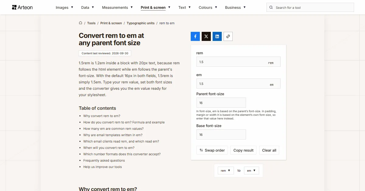
1.5rem is 1.2em inside a block with 20px text, because rem follows the html element while em follows the parent's font-size. With the default 16px in both fields, 1.5rem is simply 1.5em. Type your rem value, set both font sizes and the converter gives you the em value ready for your stylesheet.
In font-size, em is based on the parent’s font-size. In padding, margin or width it is based on the element’s own font-size, so enter that value here instead.
Why convert rem to em?
Rem gives you the same size across the whole document, because it is measured from the html element. Em is measured from the element you use it on, and in the font-size property from the parent[1]. You convert rem to em when a size should follow the text of one part of the page rather than the whole site.
A button is the classic case. Write its padding in em and changing the button's font-size alone makes the whole button, gaps included, larger or smaller. On a button with 14px text, 1rem of padding is 1.1429em and 0.75rem is 0.8571em.
If the size in your design file is in pixels, go straight to the right unit with the px to em converter or the px to rem converter.

How do you convert rem to em? Formula and example
The formula reverses the em to rem route: em = rem × html font size ÷ parent font size. The first step gives you pixels and the second turns them into em.
Say your stylesheet has 1.5rem and you want the same size inside a block with 20px text. That is 1.5 × 16 = 24px, and 24 ÷ 20 = 1.2em. Inside a 24px block, 2rem comes to 1.3333em.
In the Parent font-size field, enter the font size the em should be measured from. For font-size that is the parent, and for padding, margin or width it is the element's own font size[1]. The Base font-size field is the html element. If your stylesheet has html { font-size: 62.5% }, type 62.5% and 1rem inside a 16px parent gives 0.625em.
How many em are common rem values?
| Value in rem | 12px parent | 14px parent | 18px parent | 20px parent |
|---|---|---|---|---|
| 0.25 rem | 0.3333 em | 0.2857 em | 0.2222 em | 0.2 em |
| 0.5 rem | 0.6667 em | 0.5714 em | 0.4444 em | 0.4 em |
| 0.625 rem | 0.8333 em | 0.7143 em | 0.5556 em | 0.5 em |
| 0.75 rem | 1 em | 0.8571 em | 0.6667 em | 0.6 em |
| 0.875 rem | 1.1667 em | 1 em | 0.7778 em | 0.7 em |
| 1 rem | 1.3333 em | 1.1429 em | 0.8889 em | 0.8 em |
| 1.125 rem | 1.5 em | 1.2857 em | 1 em | 0.9 em |
| 1.25 rem | 1.6667 em | 1.4286 em | 1.1111 em | 1 em |
| 1.5 rem | 2 em | 1.7143 em | 1.3333 em | 1.2 em |
| 2 rem | 2.6667 em | 2.2857 em | 1.7778 em | 1.6 em |
| 2.5 rem | 3.3333 em | 2.8571 em | 2.2222 em | 2 em |
| 3 rem | 4 em | 3.4286 em | 2.6667 em | 2.4 em |
Why are email templates written in em?
Email clients read CSS far less reliably than browsers. According to Can I email tests, about 69.05 percent of clients support the rem unit[2], while em works in every client with a test result[3].
Rem fails in every tested version of Outlook for Windows from 2003 to 2019, in the Windows Mail app, and in Yahoo Mail and AOL on the web, iOS and Android[2]. If your newsletter template was built in rem, convert its sizes to em before you send it.

Which email clients read rem, and which read em?
| Email client | rem | em |
|---|---|---|
| Outlook for Windows, 2003 to 2019 | Not supported | Supported |
| Windows Mail | Not supported | Supported |
| Outlook.com on the web | Supported | Supported |
| Gmail on the web, Android and iOS | Supported | Supported |
| Apple Mail on macOS and iOS | Supported | Supported |
| Yahoo Mail | Not supported | Supported |
| AOL | Not supported | Supported |
| Thunderbird | Supported | Supported |
| Samsung Email | Supported | Supported |
When will you convert rem to em?
Newsletter template
Sizes from your website written in rem move into the email in em, so Outlook for Windows does not drop them.Button in several sizes
Padding and border radius in em grow with the button's text, so the small and large versions differ by a single font-size declaration.Icon next to text
An icon with a width and height of 1em always matches the text it sits beside, in a paragraph or in a heading.Letter spacing
Letter-spacing written in em, such as 0.05em, keeps the same proportion to the letters at every heading size.
Which number formats does this converter accept?
| What you type | What the converter shows | Note |
|---|---|---|
| 1.5 | 1.5 em | The point is our decimal separator, so we read the number as one and a half. |
| 1,5 | 1.5 em | A comma followed by one digit is a European decimal comma, so a value copied from a colleague in Germany or France gives the same result. |
| font-size: 1.5rem; | 1.5 em | You can paste a whole declaration from your stylesheet, because we only take the number from it. |
| margin: -0.5rem; | -0.5 em | The minus sign stays, since a negative margin in rem becomes a negative margin in em. |
| .875 | 0.875 em | A value without the leading zero, common in minified CSS, is read as 0.875. |
| 3/4 | 0.75 em | We work out the fraction straight away, so there is no need to turn it into 0.75 first. |
| 1½ | 1.5 em | The ½ character is added to the number before it, so one and a half rem gives 1.5em. |
| 1.5em | 1.5 em | An em value pasted into the rem field is converted to rem using both font-size fields, and a line under the field tells you so. |
| 24px | 1.5 em | Pixels are divided by the html element's font size, so 24px at 16px lands in the field as 1.5rem, with a line under the field explaining the change. |
Convert other units to em
Convert rem to other units
Sources
- CSS Values and Units Module Level 4 — W3C
- rem unit — Can I email
- em unit — Can I email
Every figure in the tables was computed from the unit definitions and checked arithmetically before publication. Historical values and the names of local units come from the sources listed above.
Content last reviewed: · written and checked by the Arteon team
Frequently asked questions
Won't font-size in em cause trouble when elements are nested?
It can. A font-size in em is multiplied by the parent's font size, so an element set to 1.25em inside another element set to 1.25em ends up 1.5625 times the base size. That is why rem to em conversion is mostly used for a component's padding, margins and widths, while font sizes stay in rem.
Why does the Copy result button copy a number with a point?
CSS only accepts numbers with a decimal point. A browser throws away padding: 1,1429em but applies padding: 1.1429em, so the clipboard gets the CSS-ready number without the unit.
Can I just replace rem with em across my whole email template?
Only if you convert every value from the right font size. The same rem value gives one em value in the header and another in the footer, so swapping the unit in your editor without converting gives sizes that differ from the design.
Are my values sent to a server?
No. The whole calculation runs in your browser and the numbers you type never leave it.
Help us improve our tools
Have an idea for a feature, found a bug, or want to suggest another tool? Write to us.